
Create Custom Checkboxes and Radio Buttons
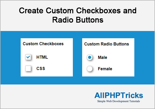
Today we will learn how to create custom checkboxes and radio buttons using CSS, HTML provide very simple checkboxes and radio buttons, which mostly do not match with your website design.
Today we will create our own custom checkboxes and radio buttons which will align with your website design and will give your website a professional look.
You might like this Create an Accordion with HTML, CSS and jQuery.
Steps to Create Custom Checkboxes and Radio Buttons
To create custom checkboxes and radio buttons, we need to follow the below steps for each (checkbox and radio buttons).
- Write an HTML Markup
- Write CSS
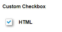
1. Write an HTML Markup for Checkbox
Create an index.html file and paste the following HTML markup of checkbox in its body section.
<div class="clearfix">
<div class="left">
<div class="checkbox">
<input type="checkbox" value="HTML" name='html' id='html' />
<label for="html"></label>
</div>
</div>
<div class="right">HTML</div>
</div>
HTML Explained
In the above HTML, we have created two main div left and right. In left div we have a .checkbox div which contain checkbox with its label. And right div having simple text.
2. Write CSS for Checkbox
Now write custom CSS for checkbox, you can copy paste the following CSS in style.css or in head section of index.html page.
body {
    font-family:Arial, Helvetica, sans-serif;
}
.clearfix:before, .clearfix:after {
    content: "";
    display: table;
}
.clearfix:after {
    clear: both;
}
.left{
    float: left;
    margin: 10px;
}
.right{
    float: left;
    margin: 13px;
    font-weight:bold;
}

/* .checkbox start*/
.checkbox {
    width: 20px;
    position: relative;
}
.checkbox label {
    width: 20px;
    height: 20px;
    cursor: pointer;
    position: absolute;
    top: 0;
    left: 0;
    background: #ffffff;
    background: linear-gradient(top, #fcfff4 0%, #dfe5d7 40%, #b3bead 100%);
    border-radius: 2px;
    box-shadow: inset 0px 1px 1px white, 3px 3px 9px rgba(0,0,0,0.5);
    border: 1px solid #babbbc;
}
.checkbox label:after {
    content: '';
    width: 9px;
    height: 5px;
    position: absolute;
    top: 4px;
    left: 4px;
    border: 3px solid #1890cf;
    border-top: none;
    border-right: none;
    background: transparent;
    opacity: 0;
    transform: rotate(-45deg);
    }
.checkbox label:hover::after {
    opacity: 0.5;
    }
.checkbox input[type=checkbox] {
    visibility: hidden;
}
.checkbox input[type=checkbox]:checked + label:after {
    opacity: 1;
}
/* .checkbox end */
CSS Explained
In the above CSS, we have hidden real checkbox button and using label on it as our checkbox button, when someone click on label, it will actually checked our real checkbox which is hidden. Label is also checked using CSS when our checkbox is checked.
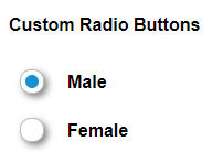
1. Write an HTML Markup for Radio Buttons
To create custom radio buttons paste the following HTML markup of radio in index.html page.
<div class="clearfix">
<div class="left">
<div class="radio">
<input type="radio" value="Male" name='gender' id='male' />
<label for="male"></label>
</div>
</div>
<div class="right">Male</div>
</div>

<div class="clearfix">
<div class="left">
<div class="radio">
<input type="radio" value="Female" name='gender' id='female' />
<label for="female"></label>
</div>
</div>
<div class="right">Female</div>
</div>
HTML Explained
In the above HTML, we have created two radio buttons, for selection of gender. All structure is same as above for checkbox.
2. Write CSS for Radio Buttons
Now write custom CSS for radio buttons, you can copy paste the following CSS in style.css or in head section of index.html page.
body {
    font-family:Arial, Helvetica, sans-serif;
}
.clearfix:before, .clearfix:after {
    content: "";
    display: table;
}
.clearfix:after {
    clear: both;
}
.left{
    float: left;
    margin: 10px;
}
.right{
    float: left;
    margin: 13px;
    font-weight:bold;
}
/* .radio button start */
.radio {
    width: 20px;
    position: relative;
}
.radio label {
    width: 20px;
    height: 20px;
    cursor: pointer;
    position: absolute;
    top: 0;
    left: 0;
    background: #ffffff;
    background: linear-gradient(top, #fcfff4 0%, #dfe5d7 40%, #b3bead 100%);
    border-radius: 10px;
    box-shadow: inset 0px 1px 1px white, 3px 3px 9px rgba(0,0,0,0.5);
    border: 1px solid #babbbc;
}
.radio label:after {
    content: '';
    position: absolute;
    top: 4px;
    left: 4px;
    border: 6px solid #1890cf;
    background: transparent;
    border-radius: 10px;
    opacity: 0;
    transform: rotate(-45deg);
    }
.radio label:hover::after {
    opacity: 0.5;
    }
.radio input[type=radio] {
    visibility: hidden;
}
.radio input[type=radio]:checked + label:after {
     opacity: 1;
    }
/* .radio button end */
CSS Explained
Above CSS for radio button is similar what we write for checkbox, we just changed the checkbox square into circle and instead of using tick symbol, we are filling circle for radio buttons.
Conclusion
Creating custom checkboxes and radio buttons are simple and easy, you have seen how we can achieve it only using HTML and CSS, with CSS you can do much more things to give a professional look of your website design.
If you found this tutorial helpful, share it with your friends and developers group.
I spent several hours to create this tutorial, if you want to say thanks so like my page on Facebook and share it.
Facebook Official Page: All PHP Tricks
Twitter Official Page: All PHP Tricks


Thanks you so much Mr.
Shukran
Thanks for the appreciation.